I’m a lifelong Apple and Mac user in Australia. I’ve been watching Apple’s keynotes live since 2004 (they usually start around 3am here), and I have spent over a decade around businesses and schools where Windows is still the default 95% of the time. I am well outside any Mac-user bubble and am well aware of how Windows users actually work.
Most of the time it is not exotic power-user stuff. It’s typically one maximised window per display they have. Mac traditionalists might find some of that heretical, but it is the reality in a lot of the world Apple is trying to sell into with the new MacBook Neo. With lower-priced machines like the MacBook Neo, Apple seems to be signalling that it’s still interested in gaining a larger share of the broader PC market.
Curiously, despite all the praise for Apple Silicon hardware, the Mac has not gained meaningful share since its introduction. On StatCounter’s worldwide desktop OS figures, Apple’s combined desktop OS share was 16.54% in November 2020, when the first Apple Silicon Macs arrived, and has dropped to 12.22% in February 2026 if you combine its current OS X and macOS categories.
So what’s going on here? Why isn’t the incredible hardware meaningfully moving the needle? As far as I can tell, the issues are mostly software problems in two forms: hardware-compatibility failures, and parts of macOS that still lag behind competitors. At scale, these small mismatches become policy problems. They turn into rollout issues, retraining, accessory replacement, and extra support tickets.
I keep running into these problems myself when I show up to a hot desk with a Mac, and I keep seeing them when other people use my Mac. The interesting people are not anti-Apple diehards, but longtime iPhone users who otherwise like Apple products and still get tripped up by Macs. I wrote about many of these same issues when Ventura came out in 2022. The striking part is how many of the same screenshots and complaints still apply now almost half a decade later.
Real-world display support should just work
This is the biggest and most visible gap between what Apple designs for and what the world really is. The Mac is still too optimised for an ideal Apple desk: 5K displays and Thunderbolt docks. But most businesses, schools, and tertiary institutions are still using ordinary 1080p or 1440p displays, typically in dual-monitor setups with much cheaper USB-C multi-display docks, not Thunderbolt docks.
Those docks rely on DisplayPort MST, or Multi-Stream Transport, to provide multiple extended displays over one cable. MST arrived with the DisplayPort 1.2 standard in 2010. It simply lets one DisplayPort connection carry multiple independent display streams through a hub or daisy chain. This is not some new or exotic trick. Macs already output DisplayPort video over USB-C and Thunderbolt, so from the outside this does not look like a case of the Mac lacking modern display hardware or bandwidth. It looks much more like missing software support in macOS.
These docks are also much cheaper than Thunderbolt docks. US Amazon prices I found were roughly USD 40-50 for MST adapters, and USD 270-330 for Thunderbolt docks. That matters for something like a MacBook Neo, a cheap Windows laptop or Chromebook with an ordinary USB-C port can plug into one of these multi-display docks and use the setup just fine, while a new MacBook Neo user cannot.
These are not niche accessories. Search Amazon and you immediately find mainstream products from brands like Anker, UGREEN, and LIONWEI with strong reviews and huge sales volumes. This is ordinary desk hardware, much of it with high wattage power pass-through as well.
Anker’s own compatibility material spells out the problem clearly: Windows gets proper multi-monitor support from setups like this, while macOS does not.

LIONWEI and UGREEN tell the same story in their own product material. That matters because Apple cannot really fall back on any ‘these accessories are junk’ excuse. These docks are everywhere precisely because they are cheap, common, and stable enough for ordinary desks. If they were broadly unreliable, they would not be so ubiquitous across businesses, schools, and home offices.
To be clear: bottom-of-the-barrel Windows laptops, Linux laptops, and Chromebooks can plug into these multi-display docks over one cable. No Mac can, regardless of its price.
The not-great workaround offered for Mac users is a DisplayLink-enabled hub, which uses extra software and a different display pipeline to drive additional screens over docks that would otherwise not behave normally on the Mac. For ordinary office work, that can be a serviceable workaround. But it is still a workaround: extra software, Screen Recording permission, and limitations vendors openly document for protected video and graphics-heavy work. DisplayLink hubs also tend to be more expensive than the DisplayPort MST ones.
This is not an abstract complaint. I end up at hot desks all the time now where the basic one-cable multi-display setup works as expected for everyone except me as the Mac user. I am the fool who has to lean behind the desk, fiddle with the dock, unplug one HDMI cable, and route it directly into a separate port on my Mac just to get a low resolution dual display setup working that nobody else has to think about.
Hilariously I have even seen Intel Macs gain MST support once booted into Windows via Boot Camp, which at least suggests software and driver support are and always were a huge part of this story.
In the Apple Silicon era I cannot prove that this is a uniquely software issue. Apple does not document enough about the full display pipeline to let anyone say that with certainty. But with Apple Silicon, that caveat gets harder and harder to take seriously. Apple now sells a MacBook Neo that can drive a 4K display at 60Hz, and MacBook Air models that can drive two 6K displays. Two 6K displays are about 40.6 million pixels in total. Two 1080p displays are about 4.1 million.
In other words, a MacBook Air can push roughly ten times the pixels of an ordinary dual-1080p desk setup. But oh sorry mum, you just bought the best selling most well reviewed dual display USB dock off Amazon to go with your brand new MacBook Air? You were meant to buy the one 5 - 10x more expensive. What don’t you understand about the fact macOS still doesn’t support MST mum!
It all smells far too much like arbitrary software support than any believable modern hardware limitation from Apple. It speaks to the larger story here of complicity, laziness, and / or ignorance from Apple resulting in real friction for potential Mac switchers which, when scaled up to the level of businesses, schools, or universities, is enough to kill that switch.
Similar friction shows up in display scaling. A huge number of Windows users I see prefer 125% or 150% scaling on ordinary displays: native resolution but with a larger UI and sharp text. On macOS, especially on the non-5K displays most people actually have, this trade-off is ugly. Either the UI feels too small at native resolution, or the scaled mode looks worse than it should and makes seemingly no attempt at keeping the UI or text sharp. This is not just an aesthetic complaint; it is also an accessibility problem. Even 4K displays have well-documented scaling artefacts on macOS, including blur, shimmering when scrolling, and moire patterns when the system renders to a scaled buffer instead of matching pixels 1:1, as Marc Edwards documented in Bjango’s write-up on Mac external displays.
Brightness control on non-Apple displays is smaller, but it points in the same direction. A lot of displays support DDC/CI. In plain English, the display already knows how to listen, but macOS behaves as if only Apple’s own displays deserve convenient controls. If a connected display supports standard brightness, the keyboard keys, the menu bar, and Control Center should be able to use it. MonitorControl and BetterDisplay exist because people clearly want this to be native.
All of this turns into sales friction. Businesses hesitate to standardise on Macs when existing desks and dock hardware do not work cleanly, the same is true in education. Even home consumers can decide it is not worth re-cabling a home office or replacing perfectly good hardware. My father seriously considered buying his first Mac this year, then I told him how the dual-display MST dock he uses at home and at work wouldn’t work with the brand new Mac. That killed the purchase, too hard!
If Apple wants people to buy beautiful 5K Apple displays later, the first step is getting them onto a Mac in the first place that works properly with the setups they already own. Businesses and education buyers can do that math quickly. If switching to Mac but preserving the ordinary dual-monitor desk setups they’re all used to requires tens of thousands of dollars in extra docks and displays on top of the Mac purchases themselves, they will just laugh and continue buying PCs.
The ask here is straightforward:
- Support extended displays over MST.
Ideally in the longer run:
- Make UI scaling cleaner and effectively resolution-independent on non-5K displays.
- Let Macs control the brightness of any display with DDC/CI.
Users want a specific window, not just an app
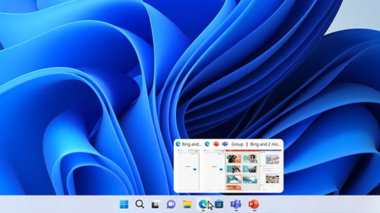
There is a broader windowing problem underneath several separate macOS features: retrieving a specific window is still awkward. Your task as a computer user is usually not ‘take me to Safari’. It is ‘show me that specific window I was using to research dishwashers.’ It is not ‘open Numbers’. It is ‘get me to that specific spreadsheet I had open earlier.’ macOS has decent answers for the app-level version of that question, but much weaker and messier answers for the window-level version.
Today the system’s answers are scattered across too many different tools. Right-click the Dock icon and parse a text list of windows. Right-click again and choose Show All Windows for App Exposé. Hit F3 to get to Mission Control. Learn about hot corners. Go to the Window menu and scan the bottom of it. Or just shuffle windows around until you find what you want.
The problem with most of these answers is that they still privilege app identity over task location. Dock menus are badly suited to multiple windows, they have no support for tabs, and they rely heavily on window titles that may not be descriptive enough to be useful.
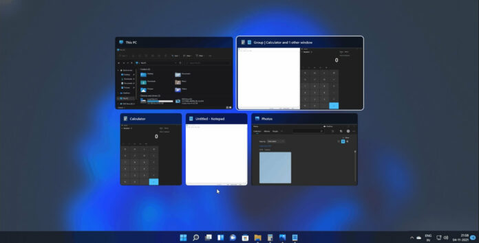
Even counting trackpad gestures, none of this is as discoverable or direct as what Windows has done for almost 20 years: put the cursor on the app icon and see the windows.
Windows taskbar previews let users identify the exact window they want by just hovering over the app icon.
Command-Tab has the same blind spot. An icon based app switcher is not enough for modern multi-window, multi-display workflows. Safari, Finder, Excel, Preview, Slack, and a code editor might each have several windows spread across displays, Spaces, and minimised states. Command-Tab just shows app buckets, not actual destinations for doing things. Apps like AltTab are insanely popular attempting to solve this exact issue.
Command-Tab quickly becomes a row of app icons with no real help identifying the specific window you actually want.
Windows solved this decades ago with a visual, window-centric switcher. macOS should keep classic Command-Tab for people who prefer it, then add a first-party visual window switcher beside it, maybe on Option-Tab, with previews, titles, minimised windows, and sane keyboard navigation.
Windows Alt-Tab is visual and window-centric, not just app-centric.
The Dock does not help enough either. I like the setting for minimising windows into the application icon because it makes the Dock cleaner (System Settings > Desktop & Dock > Minimise windows into application icon). But it exposes a similar flaw more harshly: if you minimise two windows from the same app, only the most recently minimised one comes back when you click the Dock icon. After that the second is effectively invisible. There is no badge, no stack, no preview, no hint that they still exist and you have to explicitly do one of the options I listed above to be reminded there’s still a minimised window there.
Even Mission Control and App Exposé still feel like half-finished adjacent ideas rather than a coherent system for getting to a window. That is especially frustrating because Apple was early here. Exposé arrived in 2003, and App Exposé has existed in recognisable form since Snow Leopard in 2009. Apple often says it is fine not to be first if it can be better. Here it was first, then got overtaken, and never really caught back up.
Windows also handles its virtual-desktop overview more cleanly. Desktop previews are just there, with obvious controls, instead of making you hover at the top of the screen and hunt for small plus buttons in the corner. Even after all these years, Mission Control still does not expose basic window controls or any keyboard navigation.
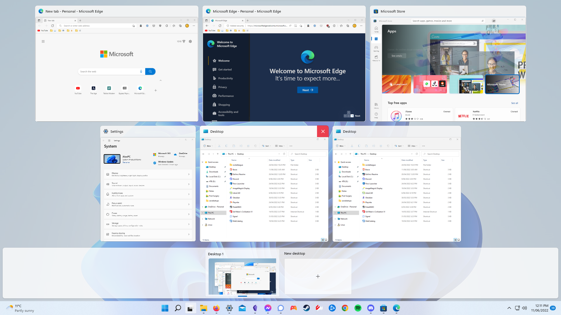
Windows Task View uses space more logically and keeps desktop controls visible.
Mission Control often scatters windows with awkward spacing and too little information.
Grouped Mission Control can look nicer at a glance (System Settings > Desktop & Dock > Group windows by application), but the expansion behavior is still awkward and poorly signposted. If windows are grouped by app, clicking a group should just open a nested App Exposé view for that app.
Grouped Mission Control looks cleaner at first, but expanding groups is still obscure and visually messy.
App Exposé is much more coherent. It at least has some basic arrow-key navigation, presumably because the windows are laid out in a more logical order.
App Exposé is much clearer than Mission Control.
Completing a task with your computer often involves a mixed set of windows belonging to different applications. Stage Manager has attempted to handle that cross-app window workflow, but there is an even bigger opportunity here. A lot of the above are really band-aid suggestions for the existing systems on macOS to simply catch up to the competition. But imagine a new ‘Mission Control 2’ where Mission Control, App Exposé, Command-Tab, and some hypothetical Option-Tab view were replaced by one coherent ‘get me somewhere’ system with organised visual switching plus easy instant text search across apps, windows, tabs, and maybe even contents. Kind of a visual version of Spotlight specifically for quickly switching between things.
What if Apple Intelligence was smart enough to know ‘you’re using these three specific windows from different apps and swapping between them to do this one task’ and intelligently surface those groups of app windows for users. Picture an Apple Intelligence managed better version of Stage Manager where you can easily orchestrate it all from ‘Mission Control 2’. Those are the sorts of features I want from Apple Intelligence.
Even more radically, imagine if macOS let you group windows from different apps into a kind of ‘super window’. A specific browser window, specific spreadsheet, and a specific message thread living together as tabs or tiled panes inside one grouped ‘task container’ where the super window has the window controls. Microsoft demoed this idea but ultimately ended it.
All of this is to say, we should not just accept desktop operating systems are finished, and Apple of all companies should still be trying to improve how modern work actually gets done on these operating systems most people still use all day at their jobs.
At a bare minimum, Apple should:
- Make Dock clicks activate App Exposé whenever an app has more than one open or minimised window.
- Add a visual keyboard window switcher as a peer to Command-Tab, not a replacement for it.
Window enlargement should be consistent
macOS still makes the basic act of making a window bigger needlessly difficult. A normal click on the green button sends a window full screen. Option-clicking that same button triggers Zoom. Double-clicking the title bar can either Zoom or Fill depending on the setting in System Settings > Desktop & Dock. But even there the behavior is inconsistent: double-clicking the title bar will un-Zoom a Zoomed window, but it will not un-Fill a Filled window. Dragging a window to the top of the screen only Fills it. Finder and Safari then make things weirder by being the only apps that treat ‘Zoom’ as a content-fit resize rather than a normal maximise action. Sequoia’s tiling additions added more confusion by making Drag windows to menu bar and Drag windows to top of screen to enter Mission Control compete inside System Settings > Desktop & Dock. If both are activated the mouse-fu required to do what you intend becomes difficult. For some reason Filling by dragging to the top of the screen always has a really slow feeling ~100ms delay before it activates, compared to the instant tiling feedback when dragging windows to the left or right edge.
This does not need to be complicated. Apple could retire Zoom entirely, make Fill the standard ‘make this window bigger’ action, and have the green button, title bar, and top-edge drag all follow the same model. Give the green button a setting to choose between Fill or Full Screen and make option click do the opposite of whatever setting is chosen by the user.
Other paper cuts still matter
Some of the remaining gaps are smaller, but they point in the same direction.
The linked Natural scrolling setting between Mouse and Trackpad is simply bad and user hostile.
Finder still does not offer a normal explicit cut-and-paste workflow for files, and it still treats path entry like an obscure trick rather than a normal part of file management. The closest thing to typing in a path is hidden in the Menu Bar under Go > Go to Folder…, while the visible path bar is buried under View > Show Path Bar.
That Finder path issue matters more than it sounds. In Windows-heavy workplaces, people share paths constantly to jump to shared drives, NAS folders, and deeply nested locations without clicking through everything by hand. In File Explorer, the path bar is just there: click it to copy the current path, paste a path someone sends you straight into it, and go.
On the Mac, copying a path is still awkward enough that many users do not even know how: hold Option while right-clicking something, copy the path, then go back through Go > Go to Folder… to paste one in. This is not some rare power-user habit. It is ordinary business behaviour, and macOS still makes it feel much harder than Windows does.
The macOS menu bar still handles icons badly on smaller displays and laptops with notches. Install a handful of apps and menu bar items start piling up, disappearing, or forcing users into constant icon housekeeping. Bartender and Ice already proved what people want: pin some icons, hide others, and put the rest behind a clean overflow area. macOS has Control Centre now, let it store and manage third party app icons.
Audio has gaps too. Per-app volume control should be built into the system, and external audio devices, in particular USB audio interfaces, should be more widely supported from the keyboard and menu bar. SoundSource is useful precisely because it solves both problems at once. The market keeps proving demand for things Apple could and should have built years ago.
I would add animation speed to the same bucket. Some motion on macOS still feels too slow, especially moving between Spaces. If Reduce Motion is enabled, the system should get genuinely faster, not just less theatrical.
Conclusion
None of these are exotic requests. Most are basic desktop features that other operating systems already handle better, or areas where macOS already has half of the right ingredients but stops short of the obvious finish line. That is what makes this feel like a business problem as much as a product-design one: there are enough small paper cuts to add up to real friction for consumers, businesses, or other institutions considering a switch to the Mac.
Macs are not losing on CPU performance, battery life, thermals, security, or browser compatibility. They are losing on the cumulative cost of workflow mismatches that create rollout exceptions, retraining, accessory replacement, and extra support overhead. Procurement teams, IT staff, and school administrators are not just asking whether the Mac is nice. They are asking whether it fits the desks, docks, displays, accessories, workflow habits, and budgets they already have.
If someone buys a lower-cost Mac after years on cheap PCs, macOS should not feel less functionally capable in these small ways than the OS they just left.
I even vibe coded workarounds for two of the smaller issues myself: Macsimize for saner maximise behaviour, and Dockmint for getting back to specific windows from the Dock. The gaps are obvious, the fixes seem tractable, and yet practical productivity improvements still arrive at a glacial pace.
Plenty of people still think Macs are incompatible with everything or harder to use, and in some cases they are unfortunately still right. Apple is still losing to arguments that are 20 years old because too many of the underlying friction points are 20 years old too. Fix the basics, market the fit, and the Mac becomes much easier to justify to a much larger chunk of the PC market.